Monday, December 8, 2008

Correlation matrix


This shows the calculated protein matrix for phag T7. They range from red to blue. http://yin.che.wisc.edu/images/ProteinMatrix.jpg

Similarity matrix


Stem and leaf plot


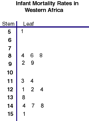
This steam and leaf shows the infant mortality rates in Western Africa. The range is 51 to 151. http://mainland.cctt.org/mathsummer/JosephBond/StemAndPlots/images/table2.gif

Box plot


This box plot shows the annual snow depth at a ski resort. You can see the range is from about 30-130 with a median of about 75. http://edubuzz.org/blogs/nbhs3x1/files/2007/01/boxplot-2.JPG

Histogram


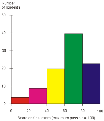
This is a hypothetical graph that shows exam scores of students. The Y axis has the exam scores and the X axis has the number of students who recieved that score. http://media.techtarget.com/digitalguide/images/Misc/iw_histogram.gif

Parallel coordinate graph


This graph was used to visualize baseball statistics. The Y axis has the baseball statistic on it like homerun, walks, ect.

Triangular plot


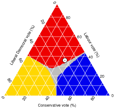
This triangular plot shows the fraction of the population intending to vote for the parties. http://ex-parrot.com/~chris/images/20050407/triangle.png

Windrose


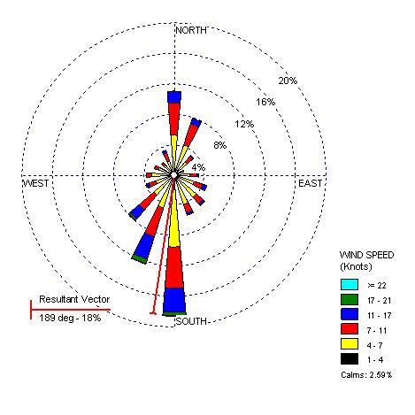
Windroses show windspeeds and the directions they are blowing in. This one is of Olympia, Washington in 2000. http://www.climate.washington.edu/windrose/Seattle-WindRose.jpg

Climograph


Climographs show precipitation and temperatures for a specific place over a period of time. This one is for Memphis, TN for a year and shows us that they reached their peak temperature in July and had the most precipiation in January. http://www.uwsp.edu/geo/faculty/ritter/images/atmosphere/climate/climographs/memphis.jpg

Population profile


This is a population profile that is pridicting figures. It is showing the predicted amount of men and women with and without aids by age. http://www.ifad.org/operations/regional/pf/figure1.gif

Scatterplot


This scatter plot has husband's age on one axis and wife's age on the other. It shows a positive correlation between the two, meaning as a husband's age goes up so does the wife's.

Friday, December 5, 2008

Index value plot


This is a prime example of an index value plot. It shows us the average streamflow index from since June 1999. This shows us if it has been exceptionally dry or wet. http://water.usgs.gov/waterwatch/regplots/real/real_us_2.gif

Lorenz Curve


This lorenz curve shows the income distribution in households. The percentage of households is plotted on one axis and the percentage of income on the other. http://www.sarpn.org.za/documents/d0000990/images/lorenz_curve.gif

Bilateral graph


Bilateral graphs show positive and negitive changes in data. This map shows the growth (or decline) of humanitarian sevices in different countries. http://www.globalhumanitarianassistance.org/New%20Images/Growth%20in%20bilateral%20humanitarian%20assistance%202005-2006%20copy.jpg

Nominal area choropleth map


This is a map of Africa that shows the political stances of the different countries. http://mapmaker.rutgers.edu/355/africa_political.gif

Thursday, December 4, 2008

Unstandardized Choropleth


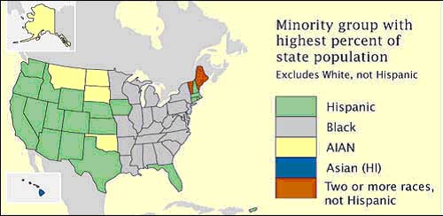
Unstandardized choropleth maps like this one show unordered and unaveraged data that have no rankings. This one shows minority goups with the highest populations in the states. https://courseware.e-education.psu.edu/courses/geog482/graphics/citationexample.jpg

Standardized choropleth maps


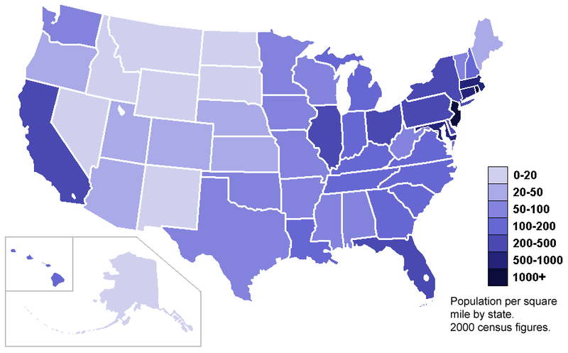
This map shows the population density of the US according to the 2000 census. It is measured by population per square mile by state. http://upload.wikimedia.org/wikipedia/commons/thumb/7/78/USA_states_population_density_map.PNG/800px-USA_states_population_density_map.PNG

Univariate Choropleth


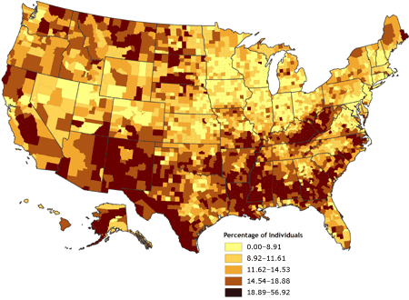
Univariate Choropleth maps only show one piece of data unlike the bivariate ones. This particular map shows the percent of indivduals who live in poverty in the US. http://www.cdc.gov/pcd/issues/2007/oct/images/07_0091_02.gif

Bivariate choropleth maps


This is a good example of a bivariate choropleth map. It shows two different pieces of data, population density in 2002 and percentage population change between the years of 1989-2002 of Russia.

Unclasses Choropleth


This unclassed Choropleth map shows acres of vegetables harvested in the United States in 2002.

Classed choropleth maps

Range graded proportional circle map


These maps use circles to show an amount of something. For example this map shows population of cities in the Great Lakes area and the larger the circles, the greater the population. http://mapmaker.rutgers.edu/355/dotProporCircle.jpg

Continuously variable proportional circle map


This is a map of West Germany that shows the major industries different cities. The map uses circles to show data and the size of the circle is in relation to the amount of data.

Wednesday, December 3, 2008

DOQQ


A digital orthophoto quartar quadrangles is a computer generated image of an ariel photograph. These are used to fix the displacement caused by camera tilits. http://www.pasda.psu.edu/tutorials/arcgis/images/doqq.jpg

DEM


DEM is a digital elevation model or a representation of a ground surface topography. http://edc.usgs.gov/images/dem.jpg

DLG


DLG stands for digital line graph and these are digital vector representations of cartographic information. This one here shows the Lake Tahoe Basin.

DRG


DRG stands for digital raster graphics. These are scanned pictures of the United States Geological Survey like the one shown here.

Isopach


Isopachs are lines on a map that connect areas that have geological structures with equal thickness.

Isohyets


Isohyets are lines on a map that connect points that have equal rainfall. The map here shows rainfall measured in millilitters.

Isotachs


Isotachs are lines on a map that connect points with equal wind speeds. The map here shows wind speeds over the eastern United States.

Tuesday, December 2, 2008

Isobars


This map shows a low pressure cell. An isobar is a line that connects points of equal pressure.

LIDAR


LIDAR stands for light detection and ranging. It measures scattered light and creates a 3D model like the one shown here.

Doppler Radar


A doppler radar is simply a radar that uses the doppler effect. This is done by bouncing echoes off of targets to measure their radial velocity. This is a doppler radar of a hurricane over Florida.

Infrared aerial photo


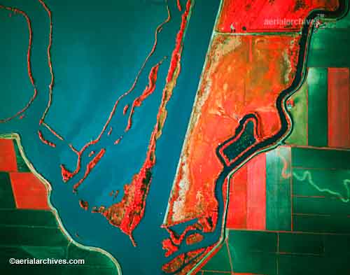
Infrared aerial photo uses different light spectrums to show many things like changes in the environment like in this picture here. http://www.aerialarchives.com/imagedb/IR0010154f.jpg

Cartographic animations


A cartographic animation map moves in some way. The movement's purpose is to show something happening over a period of time. For example in this map is showing the coast flooding as the water levels rise.

Monday, December 1, 2008

Statistical maps


Statistical maps show quantity and location of statistic data at the same time. This map shows corn farms and each dot represents 10,000 acres. http://cache.eb.com/eb/image?id=64892&rendTypeId=4

Cartograms


Cartograms are maps in which area is distorted. Like in this map of the US, the states are not displayed in the correct size instead they are shown according to the population of the counties. http://upload.wikimedia.org/wikipedia/en/4/47/Cartlinearlarge.png

Flow maps


Flow maps use lines to show movement. The thicker the line the more that is being moved and vise versa. This map is showing international telephone traffic. http://www.mundi.net/maps/maps_014/august2000_small.gif

Isoline maps


An isoline map liek the one shown is a 2D representation of something 3D. In the example here the map is showing a peak and a crater. http://www.sfei.org/ecoatlas/GIS/MapInterpretation/images/fig219.gif

Proportional circle maps


A proportional circle map uses circles to show data. For example, in this map shows internet use in Europe and the larger the circle the more people that use the internet and smaller the circle the less the people that use the internet.http://www.geog.ucsb.edu/~jeff/gis/proportional_symbols_files/map2.jpg

Tuesday, November 11, 2008

Choropleth maps


Choropleth maps are another one that use colors or shades to show proportions in information. My example shows the proportion of males per 100 females in the United States according to the 2000 Census.

Dot distribution maps


Dot distribution maps are most commonly used to show population, like in the example I used which shows the 2000 population of the US. The maps use dots to show information. When trying to show population, the more dots in the area, the more people that live there.

Propaganda maps


Here is an example of a propaganda map that is comparing infant mortality rates. A propaganda maps are directed at a specific audience and are designed to influence them to think a certain way. The information they give in the maps may or may not be true.

Hypsometric maps


This is an example of a Hypsometric maps that shows the average annual precipitation for the state of Arizona. Hypsometric maps use colors or shading and a scale to show information. http://www.ocs.orst.edu/pub/maps/Precipitation/Total/States/AZ/az.gif

PLSS maps


Here is a PLSS ( public land survey system) map that shows the townships of Alabama. These maps are used to divide land owned by the government up. http://www.rootsweb.ancestry.com/~alfrankl/plss_basemap_alabama.jpg

Cadastral maps


This is a cadastral map of the village of Pielnia. These maps show land boundaries and who owns them. http://upload.wikimedia.org/wikipedia/en/c/c9/Pielnia_1852.jpg

Thematic map


A thermatic map shows geographic patterns by using statistical data, such as income or like in my example population. The maps also use a color coded key. My example shows the population changes in the United states from 1990- 1996. http://www.sou.edu/Geography/JONES/GEOG280/stpop96.GIF

Topographic map


A tophographic map most commonly uses contour lines and shows natural and man-made features on it. The example I chose shows Stowe, Vermont and it uses 20 foot contour intervals and the scale is 1:24,000. http://upload.wikimedia.org/wikipedia/commons/thumb/7/79/Topographic_map_example.png/350px-Topographic_map_example.png

Planimetric map


A planimetric maps are digital and use lines and symbols. This map is being used to help design transportation. http://www.ncdot.org/doh/PRECONSTRUCT/highway/photo/Products/images/Planimetric_map.jpg

Mental Map


This is a good example of a mental map. It shows a child's map of the world. http://go.owu.edu/~jbkrygie/krygier_html/geog_222/geog_222_lo/geog_222_lo13_gr/sketch_proj.jpg

Friday, October 17, 2008

Remote Sensing


This is my Remote Sensing KML map that I uploaded onto google earth. The type of remote sensing that this map is is aerial photograph. I got it from this website http://epscorhydro.unm.edu/data-services/google-earth-kml-files/remote-sensing-et-maps/time-enabled-kml-file-for-remote-sensing-et-map-collection/view