Monday, December 8, 2008

Correlation matrix


This shows the calculated protein matrix for phag T7. They range from red to blue. http://yin.che.wisc.edu/images/ProteinMatrix.jpg

Similarity matrix


Stem and leaf plot


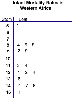
This steam and leaf shows the infant mortality rates in Western Africa. The range is 51 to 151. http://mainland.cctt.org/mathsummer/JosephBond/StemAndPlots/images/table2.gif

Box plot


This box plot shows the annual snow depth at a ski resort. You can see the range is from about 30-130 with a median of about 75. http://edubuzz.org/blogs/nbhs3x1/files/2007/01/boxplot-2.JPG

Histogram


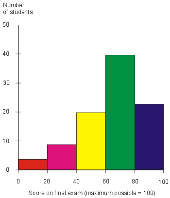
This is a hypothetical graph that shows exam scores of students. The Y axis has the exam scores and the X axis has the number of students who recieved that score. http://media.techtarget.com/digitalguide/images/Misc/iw_histogram.gif

Parallel coordinate graph


This graph was used to visualize baseball statistics. The Y axis has the baseball statistic on it like homerun, walks, ect.

Triangular plot


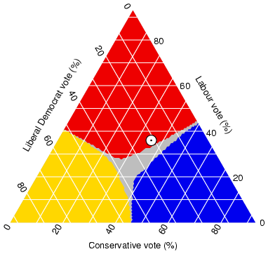
This triangular plot shows the fraction of the population intending to vote for the parties. http://ex-parrot.com/~chris/images/20050407/triangle.png

Windrose


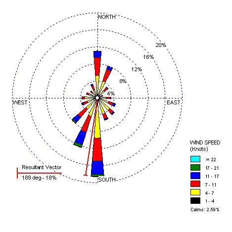
Windroses show windspeeds and the directions they are blowing in. This one is of Olympia, Washington in 2000. http://www.climate.washington.edu/windrose/Seattle-WindRose.jpg

Climograph


Climographs show precipitation and temperatures for a specific place over a period of time. This one is for Memphis, TN for a year and shows us that they reached their peak temperature in July and had the most precipiation in January. http://www.uwsp.edu/geo/faculty/ritter/images/atmosphere/climate/climographs/memphis.jpg

Population profile


This is a population profile that is pridicting figures. It is showing the predicted amount of men and women with and without aids by age. http://www.ifad.org/operations/regional/pf/figure1.gif

Scatterplot


This scatter plot has husband's age on one axis and wife's age on the other. It shows a positive correlation between the two, meaning as a husband's age goes up so does the wife's.

Friday, December 5, 2008

Index value plot


This is a prime example of an index value plot. It shows us the average streamflow index from since June 1999. This shows us if it has been exceptionally dry or wet. http://water.usgs.gov/waterwatch/regplots/real/real_us_2.gif

Lorenz Curve


This lorenz curve shows the income distribution in households. The percentage of households is plotted on one axis and the percentage of income on the other. http://www.sarpn.org.za/documents/d0000990/images/lorenz_curve.gif

Bilateral graph


Bilateral graphs show positive and negitive changes in data. This map shows the growth (or decline) of humanitarian sevices in different countries. http://www.globalhumanitarianassistance.org/New%20Images/Growth%20in%20bilateral%20humanitarian%20assistance%202005-2006%20copy.jpg

Nominal area choropleth map


This is a map of Africa that shows the political stances of the different countries. http://mapmaker.rutgers.edu/355/africa_political.gif

Thursday, December 4, 2008

Unstandardized Choropleth


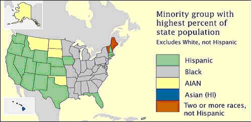
Unstandardized choropleth maps like this one show unordered and unaveraged data that have no rankings. This one shows minority goups with the highest populations in the states. https://courseware.e-education.psu.edu/courses/geog482/graphics/citationexample.jpg

Standardized choropleth maps


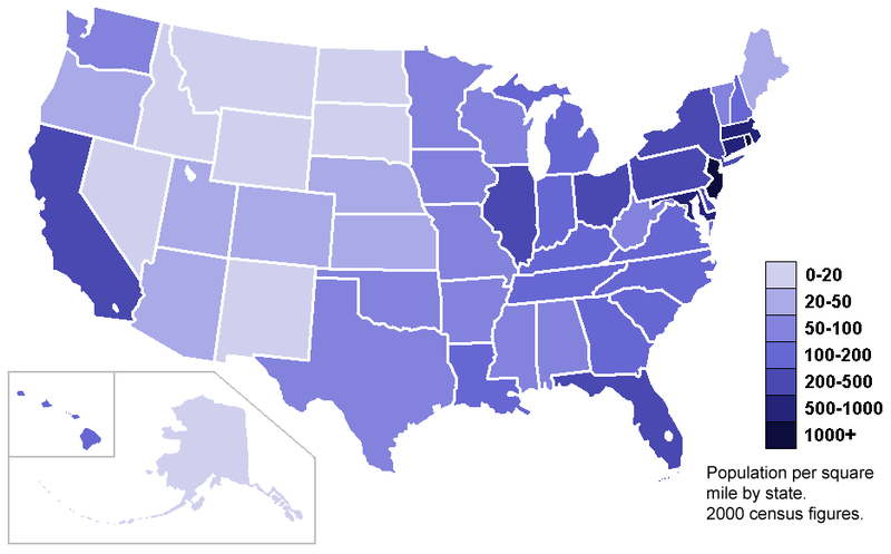
This map shows the population density of the US according to the 2000 census. It is measured by population per square mile by state. http://upload.wikimedia.org/wikipedia/commons/thumb/7/78/USA_states_population_density_map.PNG/800px-USA_states_population_density_map.PNG

Univariate Choropleth


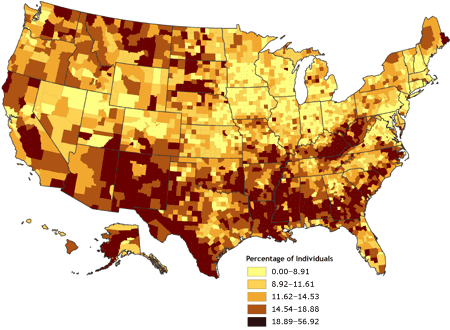
Univariate Choropleth maps only show one piece of data unlike the bivariate ones. This particular map shows the percent of indivduals who live in poverty in the US. http://www.cdc.gov/pcd/issues/2007/oct/images/07_0091_02.gif

Bivariate choropleth maps


This is a good example of a bivariate choropleth map. It shows two different pieces of data, population density in 2002 and percentage population change between the years of 1989-2002 of Russia.

Unclasses Choropleth


This unclassed Choropleth map shows acres of vegetables harvested in the United States in 2002.